Often when I work with leaders of organisations one of my key tasks is to analyse existing data to se what I can learn about the business. When I do this and provide the feedback to the owners and managers I am always pleased to be able to show them other ways of looking at their business data to highlight patterns, trends and more importantly opportunities for improvement.
Turning over the rocks
Having a lot of experience working with data, I have been able to develop the skills to extract data, clean it to make it meaningful and then analyse it to provide insights into a business operation. I remember once working with a finance and operations teams and, while presenting the data analysis, one of the team said to me “Wow, you really know which rocks to look under”. That’s the beauty of doing what I do, I can use these investigative skills across a range of sectors to help people improve their business performance by helping them look at their own data in other ways.
Simple tools, easily applied
What I like best is that the techniques I use to analyse data can be taught others using the software that already exists on most people computers. In most circumstances there is no need to purchase expensive third party platforms that have steep learning curves. I use common software but set it up so that users can be self-sufficient in their ongoing use of the tools and techniques.
Data analysis is helpful, and doing deep dives on data from time to time is extremely valuable, however when this data is used for a business dashboard then the true ongoing power is released.
What Makes a Good Dashboard?
As every business operates a bit differently, there is no one best template for a dashboard for an organisation. It really is up to senior management to articulate the measures that have the most significant impact on the operation of the business. Although there is no ‘one best way’ there are a few tips that I think are relevant for every dashboard.
- Be clear on the audience for the dashboard
- Keep a small number of key metrics at the top
- Use colour coding to aid understanding
- Green all OK
- Orange or Yellow warning, attention may be required
- Red – alert or corrective action required
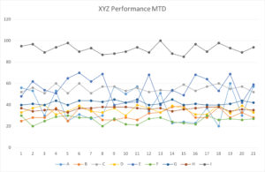
- When using graphs, simple is best. Avoid numerous overlaid lines like the type of chart shown here.
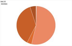
- Pie charts are good to show relative proportions.
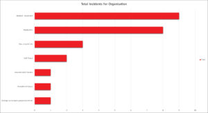
Bar graphs are clear and can be sorted in a variety of ways to aid clarity.
- Consistent colours for categories/sites/products etc
- Have a hierarchy of dashboards if there is lots of data to monitor to assist in ‘drilling down’ to problems
- Keep each dashboard simple
Remember the purpose of the dashboard is to give people timely, relevant, useful feedback to indicate that things are on track or if there is something developing that needs further attention.
How Hi-Tech Does The Dashboard Need To Be?
In short, not very!
I often get asked by managers if specific software for creating dashboards in needed. Although there is some great software available for all sorts of situations, I generally encourage people to use the tools that are already available in their business to start. Many organisations that need a dashboard are, frankly, not in a position to afford expensive new custom software that requires specialist training to develop and maintain. I’m very much of the opinion of ‘walk before we run’ when it comes to implementing solutions.
Just about every organisation has data and some form of spreadsheet application. With a bit of thought, these can be used to great effect to create meaningful dashboards that provide business managers with the insights they need to help them make the right operational and strategic decisions for their organisation.
My one caveat in relation to creating a good dashboard is that the data needs to be ‘clean’. Clean data is free from typo’s in the key fields, the usual culprits are bad date formats and extra spaces in category identifiers. These can usually be overcome quite easily by having spreadsheets or databases with some validation of the data entry to alert the user to errors.
One last tip on dashboards is that they can develop over time to include other items to make them more useful as the needs of the business grows. If you are just starting out with a dashboard, you don’t have to create the perfect dashboard straight away, start with something that’s of interest and let it evolve as your needs develop.
John Yealland is a management consultant and process improvement expert who has worked with business leaders in a wide range of industries to help them improve the performance of their organisation.